Madison is having a wet year. The cumulative precipitation for 2026 has been close to record highs, and several rain events led to localized flooding. Impervious surfaces like building roofs or parking lots contribute to this flooding. The city of Madison has an open data set of those areas, inspiring me to a little data visualization exercise.
Show code
Rows: 231,692
Columns: 12
$ OBJECTID         <dbl> 1, 2, 3, 4, 5, 6, 7, 8, 9, 10, 11, 12, 13, …
$ source_area      <dbl> 6, 6, 6, 6, 6, 6, 6, 1, 1, 1, 1, 0, 0, 0, 0…
$ GeometryFrom     <chr> "HydroPoly_RFPArea", "HydroPoly_RFPArea", "…
$ created_user     <chr> NA, NA, NA, NA, NA, NA, NA, NA, NA, NA, NA,…
$ created_date     <chr> NA, NA, NA, NA, NA, NA, NA, NA, NA, NA, NA,…
$ last_edited_user <chr> "JD431020", "JD431020", "JD431020", "JD4310…
$ last_edited_date <chr> "2022/05/31 20:46:26+00", "2022/05/31 20:46…
$ MERGE_SRC        <chr> "Task4_ImperviousUpdate2022_Tyler", "Task4_…
$ source_area_int  <dbl> 6, 6, 6, 6, 6, 6, 6, 1, 1, 1, 1, 0, 0, 0, 0…
$ source_area_desc <chr> "Water Body Areas", "Water Body Areas", "Wa…
$ ShapeSTArea      <dbl> 7470.6747, 49852.3827, 87432.1140, 87947.58…
$ ShapeSTLength    <dbl> 387.57258, 1154.00563, 1266.78646, 1307.461…
First we need to do some cleanup. The source_area_dest variable is the human readable description of the type of impervious area. It has 231692 values:
Show code
imp |>
  distinct(source_area_desc)
# A tibble: 15 × 1
source_area_desc
<chr>
1 Water Body Areas
2 Sloped Roof
3 Flat Roof
4 Other Impervious Areas
5 Sidewalks
6 Streets
7 Other Pervious Areas
8 Driveways
9 Parking
10 Unpaved Parking
11 Playground
12 Alleys
13 Undeveloped Areas
14 Landscaped Areas
15 Isolated Areas We consolidate the two different roof types into one and don’t distinguish between paved and unpaved parking. The area is provided in square feet and we’ll convert to square miles.
Show code
# A tibble: 13 × 3
   source_area_desc             area area_sq_mi
   <fct>                       <dbl>      <dbl>
 1 Alleys                    233482. 0.00838
 2 Driveways              120826033. 4.33
 3 Buildings              233838195. 8.39
 4 Isolated Areas               177. 0.00000636
 5 Landscaped Areas         4661434. 0.167
 6 Other Impervious Areas  15523764. 0.557
 7 Other Pervious Areas     5372399. 0.193
 8 Parking                136611397. 4.90
 9 Playground               1718922. 0.0617
10 Sidewalks               53799154. 1.93
11 Streets                211008295. 7.57
12 Undeveloped Areas        5462427. 0.196
13 Water Body Areas        54430365. 1.95
This would make for a perfectly fine table (and we’ll make that later), but why not have a little fun and turn it into a waffle chart? The waffle package makes that relatively easy. “Relatively” because in practice you need to do a lot of tinkering to get a truly nice looking chart. Pick a sensible number of categories, units, comprehensible (but included in the free Fontawesome icon set!) icons, arrange rows and columns, scale everything just right, etc. Here’s my solution:
Show code
df |>
  mutate(source_area_desc = if_else(
    source_area_desc %in% (df %>% slice_min(area, n = 7) %>% pull(source_area_desc)),
    "other",
    source_area_desc
  )) %>%
  summarise(area = sum(area_sq_mi*5), .by = source_area_desc) |>
  arrange(desc(area)) |>
  mutate(source_area_desc = fct_reorder(source_area_desc, -area)) |>
  ggplot(aes(label = source_area_desc, values = area)) +
  geom_pictogram(
    size = 8,
    n_rows = 10,
    aes(colour = source_area_desc),
    flip = TRUE
     #make_proportional = TRUE
  ) +
  scale_label_pictogram(
  name = NULL,
  values = c("building", "road", "parking", "warehouse", "water", "walking", "map"),
  labels = c("Buildings", "Streets", "Parking", "Driveways", "Water body areas", "Sidewalks", "other")
) +
  scale_color_manual(
    name = NULL,
    values = viridisLite::viridis(7, option = "D"),
    labels = c("Buildings", "Streets", "Parking", "Driveways", "Water body areas", "Sidewalks", "other")
  ) +
  coord_equal() +
  hrbrthemes::theme_ipsum_rc(grid="") +
  waffle::theme_enhance_waffle() +
  labs(title = "Impervious surface in Madison",
       subtitle = "Each symbol represents ~1/5 square mile",
       caption = "Data: City of Madison Stormwater Modeling Impervious Land Cover Type") +
  theme(
    legend.key.height = unit(2.25, "line"),
    legend.text = element_text(size = 10, hjust = 0, vjust = 0.75)
) 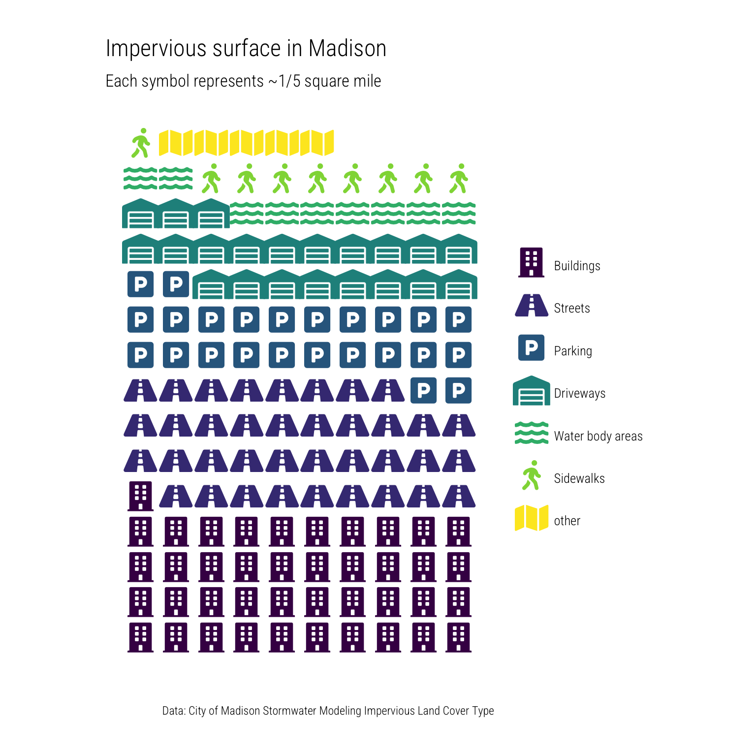
Now as I said, the waffle chart/pictogram looks cool. But if we’re being honest, this waffle chart could have been a table. So let’s make a nice one.
Show code
df |>
  mutate(source_area_desc = if_else(
    source_area_desc %in% (df %>% slice_min(area, n = 7) %>% pull(source_area_desc)),
    "other",
    source_area_desc
  )) %>%
  mutate(total_area = sum(area)) |>
  summarise(area_pct = sum(area/total_area), area = sum(area_sq_mi), .by = source_area_desc) |>
  arrange(desc(area)) |>
  gt() |>
  cols_label(source_area_desc = "Type",
             area = html("Total area (mi<sup>2</sup>)"),
             area_pct = "% of total impervious area") |>
  cols_move(columns = area_pct, after = area) |>
  fmt_percent(columns = "area_pct",
              decimals = 1) |>
  fmt_number(columns = area, decimals = 2) |>
  tab_header(title = paste0("Madison has ", round(df |> summarize(total = sum(area_sq_mi)) |> pull(total), 1), " square miles of impervious surface"),
             subtitle = "Buildings and streets make up over half of that") |>
tab_source_note("Data: City of Madison")| Madison has 30.3 square miles of impervious surface | ||
| Buildings and streets make up over half of that | ||
| Type | Total area (mi2) | % of total impervious area |
|---|---|---|
| Buildings | 8.39 | 27.7% |
| Streets | 7.57 | 25.0% |
| Parking | 4.90 | 16.2% |
| Driveways | 4.33 | 14.3% |
| Water Body Areas | 1.95 | 6.5% |
| Sidewalks | 1.93 | 6.4% |
| other | 1.18 | 3.9% |
| Data: City of Madison | ||
Depending on the audience and the story you’re trying to tell, either form of presenting the data could be appropriate. For example, if the exact proportions in each category matter, a table probably is the better choice. But to get a quick glimpse of the major types of impervious surfaces, the waffle chart is a good looking visualization.