I’m trying to write more short blog posts. This is one of them. In the context of my recent post on the state of biking in Madison, I was curious about where Madison and Dane County have seen job growth. One explanation for a declining bike mode share could be that jobs are created at the periphery, where people have longer commutes and those commute routes may lack good bike facilities.
Job data is available from the Longitudinal Employer-Household Dynamics (LEHD) data set via the ledhr R package. Let’s download 2015 and 2019 data (I wanted a pre-pandemic end year), calculate the change in jobs of all kind.
Show code
library(tidyverse)
library(tmap)
library(tidycensus)
library(lehdr)
library(sf)

# get dane county geography
dane_county <- tigris::block_groups(55, 25, cb = T)
# job data at the block group level
jobs_2019 <- grab_lodes(
  state = "WI",
  year = 2019,
  lodes_type = "wac", # for workplace geography
  agg_geo = "bg",
  use_cache = TRUE
)
jobs_2015 <- grab_lodes(
  state = "WI",
  year = 2015,
  agg_geo = "bg",
  lodes_type = "wac",
  use_cache = TRUE
)


jobs_change <- rbind(jobs_2015, jobs_2019) |>
  select(year, C000, w_bg) |>
  pivot_wider(
    names_from = year,
    values_from = C000, # total number of jobs variable
    names_prefix = "jobs_"
  ) |>
  mutate(job_growth = jobs_2019 - jobs_2015)
jobs_change <- dane_county |>
  left_join(jobs_change, by = join_by(GEOID == w_bg)) |>
  filter(ALAND != 0) # filter out the lakes
Now we can create a choropleth map of those changes:
Show code
tmap_mode("view")

jobs_change |>
  filter(!is.na(job_growth)) |>
  tm_shape() +
  tm_polygons(
    col = "job_growth",
    title = "Job growth 2015-2019", style = "jenks",
    alpha = .7
  )
There doesn’t seem to be a clearly discernible patter: Some areas on and near the isthmus have seen job growth, but so do some more suburban areas. Rather than only looking at a map, we can also create a scatterplot of the numbers of new jobs and the distance of the block group from the Wisconsin State Capitol:
Show code
# coordinates for the Capitol
point_data <- data.frame(
  x = 43.074722,
  y = -89.384167
)

# Create an sf object with a single point
capitol_sf <- st_as_sf(point_data, coords = c("y", "x"))

# calculate block group centroids
jobs_centroids <- jobs_change |>
  st_centroid()

st_crs(capitol_sf) <- st_crs(jobs_centroids)

# st_distance doesn't work well with the tidyverse and we use `map` instead to calculate the distances to the Capitol
x <- map(1:nrow(jobs_centroids), function(x) st_distance(jobs_centroids[x, ], capitol_sf))

jobs_centroids$dist_to_capitol <- as.numeric(x)

jobs_distances <- jobs_centroids |>
  filter(!is.na(job_growth)) |>
  st_drop_geometry() |>
  mutate(dist_to_capitol_mi = dist_to_capitol / 1609.344)

jobs_distances |>
  ggplot(aes(dist_to_capitol_mi, job_growth)) +
  geom_point() +
  theme_minimal() +
  xlab("Distance to Capitol (miles)") +
  ylab("Job gain/loss 2015-2019") +
  labs(title = "Job growth by distance from Wisconsin State Capitol")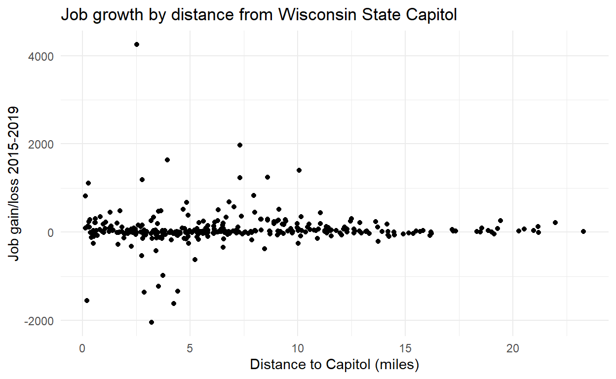
It looks like the block groups with the largest changes in either direction are less than five miles from the Capitol, and past 10 miles there aren’t really any block groups that saw large job growth or decline over that time period.
Another way to look at the data is to create distance bins and tabulate the job changes within each category:
Show code
library(gt)
jobs_distances |>
  mutate(dist_bins = cut(dist_to_capitol_mi, breaks = c(0, 5, 10, 15, 20, Inf), labels = c("<5 miles", "5 to <10 miles", "10 to <15 miles", "15 to <20 miles", ">20 miles"))) |>
  summarise(job_growth_agg = sum(job_growth), .by = dist_bins) |>
  gt() |>
  tab_header(
    title = "Job growth by distance from Wisconsin State Capitol",
    subtitle = "2015 to 2019"
  ) |>
  cols_label(
    dist_bins = "Distance",
    job_growth_agg = "Growth in jobs"
  ) |>
tab_source_note("Data: LEHD at block group level aggregation")| Job growth by distance from Wisconsin State Capitol | |
| 2015 to 2019 | |
| Distance | Growth in jobs |
|---|---|
| <5 miles | 3168 |
| 5 to <10 miles | 12558 |
| 10 to <15 miles | 4004 |
| 15 to <20 miles | 466 |
| >20 miles | 501 |
| Data: LEHD at block group level aggregation | |
That’s all for now—I think the next step will be to do the same type of analysis for housing growth.