Last week Allison Garfield published an article in the Cap Times, asking why Madison rents are rising so fast and won’t slow down. It’s a great article about the strain that rising rents have put on residents and what the city can and cannot do about it. For rent data, the article relies on a report from Apartment List, a commercial apartment listing platform:
A national study from Apartment List in March found that rent prices in Madison have jumped 14.1% over the past year and 30.4% since March 2020. It was the fastest-rising rent of any major city in the United States, the study reported. The average one-bedroom apartment in January 2017 rented for $873. In April 2023, that number clocks in at $1,322.
You can read more on how Apartment List calculates their numbers here. I was curious how the Apartment List numbers compare to data from the American Community Survey. The American Community Survey provides a lot of data about housing, and we can look at the data going back almost 20 years.
What follows are a number of charts about rents and renting in Madison and in other large cities in the US.
Renters
First, how many people in Madison actually are renters?
Show code
get_renters <- function(acs_year){
  get_acs("place",
          table = "B25003",
          year = acs_year,
          survey = "acs1",
          summary_var = "B25003_001",
          cache_table = TRUE)
}

years <- c(2005:2019,2021) # 2020 has no 1y estimates
names(years) <- years

renters <- map_dfr(years, get_renters, .id = "year")

renters |>
  filter(NAME == "Madison city, Wisconsin") |>
  filter(variable == "B25003_003") |>
  mutate(renters_pct = estimate / summary_est) |>
  ggplot(aes(as.numeric(year), renters_pct)) +
  geom_line() +
  hrbrthemes::theme_ipsum() +
  scale_y_continuous(labels = label_percent()) +
  labs(title = "About half of households in Madison are renters",
       x = "year",
       y = "renter households",
       caption = "Data: American Community Survey 1-year estimates B25003 \nVisualization: Harald Kliems")
Madison is pretty much split in half: 51% of households rented in 2021. We can compare this to the 50 most populous cities in the US:
Show code
# get population
pop <- get_acs(
  "place",
  table = "B01003",
  survey = "acs1",
  cache_table = TRUE
)

largest_50 <- pop |>
  arrange(desc(estimate)) |>
  head(50) |>
  pull(GEOID)


renters_50 <- renters |>
  filter(GEOID %in% largest_50 | NAME == "Madison city, Wisconsin") |>
  mutate(city = str_replace(NAME, " city", "")) |>
  filter(variable == "B25003_003") |>
  mutate(renters_pct = estimate / summary_est)

min_max_cities <- renters_50 |>
  filter(year == 2021) |>
  filter(renters_pct == min(renters_pct) | renters_pct == max(renters_pct)) |>
  pull(city)

renters_50 |>
  ggplot(aes(as.numeric(year), renters_pct, group = city)) +
  geom_line() +
  hrbrthemes::theme_ipsum() +
  scale_y_continuous(labels = label_percent()) +
  labs(title = "Percentage of renter households in Madison and 50 most populous US cities",
       x = "year",
       y = "renter households",
       caption = "Data: American Community Survey 1-year estimates B25003 \nVisualization: Harald Kliems") +
  xlim(c(2005, 2024)) +
  gghighlight(city %in% c(min_max_cities, "Madison, Wisconsin"))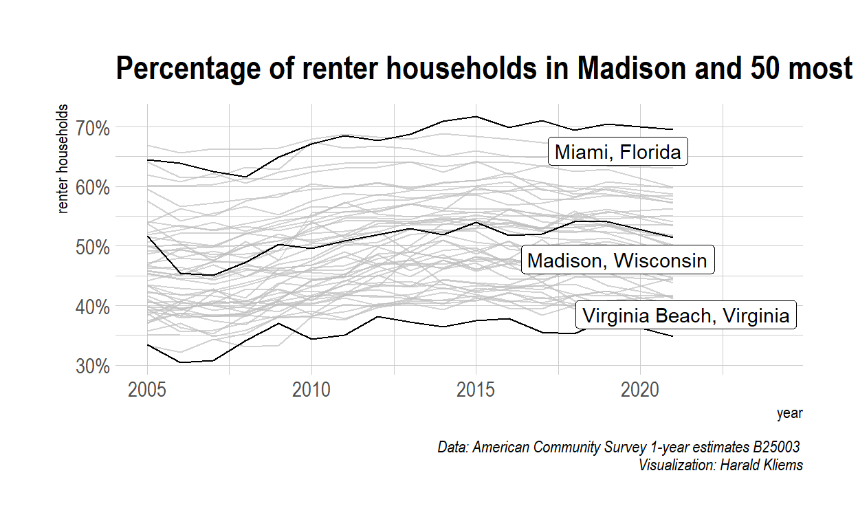
Madison is somewhere in the middle. Miami had the highest percentage of renters (70%) in 2021, whereas Virginia Beach had the lowest (35%).
Rent
How much rent do these households pay? The American Community Survey reports on “gross median rent,” which is “the sum of contract rent and the average cost of the utilities (electricity, gas, and water and sewer) and fuel (oil, coal, kerosene, wood, etc).”
Show code
get_rents <- function(acs_year){
  get_acs("place",
          table = "B25064",
          year = acs_year,
          survey = "acs1",
          cache_table = TRUE) |>
    rename(rent = estimate)
}


rents <- map_dfr(years, get_rents, .id = "year")

madison_rent <- rents |>
  filter(NAME == "Madison city, Wisconsin")

madison_rent |>
  ggplot(aes(x = as.numeric(year), y = rent)) +
  geom_line() +
  scale_y_continuous(labels = label_dollar()) +
  hrbrthemes::scale_color_ipsum() +
  labs(title = paste0("Median rent in Madison increased \nfrom $",
                      madison_rent$rent[[1]],
                      " in 2005 to $",
                      madison_rent$rent[[nrow(madison_rent)]],
                      " in 2021"),
       x = "Year",
       y = "median gross rent",
       caption = "Data: American Community Survey 1-year estimates B25064\nVisualization: Harald Kliems") +
hrbrthemes::theme_ipsum() 
Show code
  # xlim(c(2005, 2023)) +
  # theme(legend.position = "none",
  #       plot.margin = unit(c(1,1,1,1), "cm")) +
  # geom_text(aes(x = 2021.2, y = 3532, label = "income"), hjust = "left") +
  # geom_text(aes(x = 2021.2, y = 1237, label = "rent"), hjust = "left")
Unsurprisingly, rent has gone up a lot since 2005. The median renter now pays 63% more than they did in 2005. Again, we can compare Madison with the 50 most populous US cities:
Show code
rents_50 <- rents |>
  filter(GEOID %in% largest_50 | NAME == "Madison city, Wisconsin") |>
  mutate(city = str_replace(NAME, " city", ""))

min_max_rent_cities <- rents_50 |>
  filter(year == 2021) |>
  filter(rent == min(rent) | rent == max(rent)) |>
  pull(city)

rents_50 |>
  ggplot(aes(as.numeric(year), rent, group = city)) +
  geom_line() +
  hrbrthemes::theme_ipsum() +
  scale_y_continuous(labels = label_dollar()) +
  labs(title = "Rent is lowest in Wichita, highest in San Jose",
       x = "year",
       y = "median gross rent",
       caption = "Data: American Community Survey 1-year estimates B25064 \nVisualization: Harald Kliems") +
  xlim(c(2005, 2025)) +
  gghighlight(city %in% c(min_max_rent_cities, "Madison, Wisconsin"))
There’s a huge spread in the median rent: In 2021, the median rent in Wichita was about $850, whereas in San Jose it was $2300!
If we’re interested in change over time, it makes sense to look at an indexed version of this data: We set the rent in the year 2005 to a value of 100 in each of the cities and then look at how that index changes over time.
Show code
# function for indexing:
index_function <- function(x){
  # input: x, a vector
  # output: x_indexed, a vector
  initial <- x[1]
  map_dbl(x, function(x){x/initial * 100})
}


rents_50 |>
  group_by(NAME) |>
  mutate(city = str_replace(NAME, " city", "")) |>
  mutate(rent_index = index_function(rent)) |>
  ggplot(aes(as.numeric(year), rent_index, group = city)) +
  geom_line() +
  scale_y_continuous() +
  xlim(c(2005, 2023))+
  gghighlight::gghighlight(city %in% c("Madison, Wisconsin",
                                       "Seattle, Washington",
                                       "Detroit, Michigan"),
                           label_params = list(linewidth = 10)) +
  hrbrthemes::theme_ipsum() +
  xlab("year") +
  ylab("indexed rent") +
  labs(title = "Median rent in Madison compared to 50 largest US cities",
       subtitle = "Indexed to 2005 rent",
       caption = "Data: American Community Survey 1-year estimates\nVisualization: Harald Kliems")
As we see above, all cities are on an upward trajectory, but that trajectory is much steeper for some cities than for others: In Seattle, the indexed rent is at 220 in 2021, i.e. people now pay 2.2 times as much as they did in 2005. At the bottom of the chart is Detroit, where rent now is about 1.4 times what is was in 2005. As we already saw in the previous chart, Madison’s increases are at about 1.6 times.
Rent and income
Looking at rent alone is not enough. We should also look at income: Rising rents are less of an issue when incomes rise accordingly. (Of course it’s more complicated than that. For example, an influx of new high-income residents plus stagnating incomes for current residents can still result in displacement)
Show code
get_renter_income <- function(acs_year){
  get_acs("place",
        variable = "B25119_003",
        year = acs_year,
        survey = "acs1",
        cache_table = TRUE) |>
    rename(income = estimate) |>
    mutate(income = income/12)
}

renter_income <- map_dfr(years, get_renter_income, .id = "year")

rent_and_income <- rents |>
  left_join(renter_income, by = c("NAME", "year")) |>
  select(year, rent, income, NAME) |>
  pivot_longer(c("rent", "income"), names_to = "name", values_to = "value")

rent_and_income |>
filter(NAME == "Madison city, Wisconsin") |>
ggplot(aes(x = as.numeric(year), y = value, color = name)) +
  geom_line() +
  hrbrthemes::scale_color_ft() +
  scale_y_continuous(labels = label_dollar(), limits = c(500, 4000)) +
  labs(title = "Median rent and income in Madison\nboth have gone up between 2005 and 2021",
       x = "Year",
       y = element_blank(),
       caption = "Data: American Community Survey 1-year estimates\nVisualization: Harald Kliems") +
  hrbrthemes::theme_ipsum() +
  xlim(c(2005, 2023)) +
  theme(legend.position = "none",
        plot.margin = unit(c(1,1,1,1), "cm")) +
  geom_text(aes(x = 2021.2, y = 3532, label = "income"), hjust = "left") +
  geom_text(aes(x = 2021.2, y = 1237, label = "rent"), hjust = "left")
A common way to define housing affordability is to look at the proportion of housing cost to household income. So for a theoretical household making the median income and paying the median rent, what proportion of that income goes to rent?
Show code
rent_and_income |>
  filter(NAME == "Madison city, Wisconsin") |>
  pivot_wider(names_from = "name", values_from = "value") |>
  mutate(rent_pct = rent  /income) |>
  ggplot(aes(as.numeric(year), rent_pct)) +
  geom_line() +
  hrbrthemes::theme_ipsum() +
  scale_y_continuous(labels = label_percent(),
                     limits = c(.25, .4)) +
  xlim(c(2005, 2024)) +
  labs(title = "Rent as percentage of household income in Madison, WI",
       x = "Year",
       y = element_blank(),
       caption = "Data: American Community Survey 1-year estimates\nVisualization: Harald Kliems") +
  annotate("segment", x = 2005, xend = 2021, yend = .3, y = .3,
           linetype = 2) +
  annotate("text", x = 2021.5, y = .29, label = "Rent-burdened threshold",
           vjust = "inward")
Generally, 30 per cent is considered the threshold at which someone is considered “rent burdened.” And our theoretical median household is above that threshold in all years since 2005. There’s a spike right after the financial crisis, followed by a slow decline, and then the percentage goes up again with the pandemic.
Rather than looking at a median household, the American Community Survey also provides the number of households who actually are rent burdened.
Show code
# rent burdened
get_rent_burden <- function(acs_year){
  get_acs("place",
          table = "B25106",
          year = acs_year,
          survey = "acs1",
          summary_var = "B25106_024", #Estimate!!Total!!Renter-occupied housing units
          cache_table = TRUE) |>
    filter(GEOID %in% largest_50 | NAME == "Madison city, Wisconsin")
}

years <- c(2005:2019,2021)
names(years) <- years

rent_burden <- map_dfr(years, get_rent_burden, .id = "year")

rent_burden |>
  filter(variable %in% c("B25106_044",
                         "B25106_040",
                         "B25106_036",
                         "B25106_032",
                         "B25106_028")) |>
  group_by(NAME, year) |>
  summarize(all_burdened = sum(estimate)) |>
  filter(NAME == "Madison city, Wisconsin") |>
  ggplot(aes(as.numeric(year), all_burdened)) +
  geom_line()+
  ylim(c(0, 33000)) +
  labs(title = "Madison renter households that spend \n 30+% of income on housing",
       y = "number of households",
       x = "year",
       caption = "Data: American Community Survey 1-year estimates B25106\nVisualization: Harald Kliems") +
  hrbrthemes::theme_ipsum()
The total number is fairly flat over time in Madison, which is not bad for a city that has grown a lot in overall population over that time period. We can chart the percentage of rent-burdened household as the share of all renter households and compare Madison with other cities.
Show code
rent_burden |>
  filter(variable %in% c("B25106_044",
                         "B25106_040",
                         "B25106_036",
                         "B25106_032",
                         "B25106_028")) |>
  mutate(city = str_replace(NAME, " city", "")) |>
  group_by(city, year) |>
  reframe(all_burdened = sum(estimate), burdened_pct = all_burdened/summary_est) |>
  distinct() |>
  # filter(NAME == "Madison city, Wisconsin") |>
  ggplot(aes(as.numeric(year), burdened_pct, group = city)) +
  geom_line()+
  scale_y_continuous(labels = label_percent()) +
  xlim(c(2005, 2023)) +
  labs(title = "Rent-burdened households in 50 most populous US cities and Madison",
       subtitle = "Proportion of renter-households that spend 30+% of household income on housing",
       y = "rent burdened households",
       x = "year",
       caption = "Data: American Community Survey 1-year estimates B25106\nVisualization: Harald Kliems") +
  hrbrthemes::theme_ipsum() +
  gghighlight::gghighlight(city %in% c(
    "Madison, Wisconsin",
    "Miami, Florida",
    "San Francisco, California"), label_params = list(hjust = "right"))
This chart is probably surprising to many (it certainly was to me!). San Francisco is often considered the prime example of the housing crisis. And Miami (which, as we saw above, has the highest proportion of renters to owners) rarely comes up in national debates about the burden of rent. This just goes to show that the relationship between rents and incomes is complicated: Yes, rising rent is less of an income when incomes rise accordingly. But rising incomes can also take on the form of an influx of higher-income people and the displacement of folks with lower incomes.
Are you interested in any other rent-related statistics or have questions? Shoot me an email!